DR. ME visited today, and I had done something I hadn't done in years, cut and paste.
It was a great way to get back into the experimental roots of design and hold off on a Mac for once.
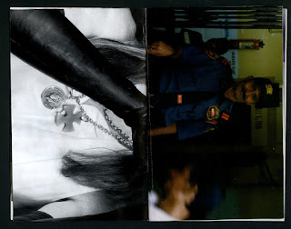
The task was to create a 'happy accident'. This consisted of cutting and pasting from old magazines and publications to create a small format zine. I must say, this is the quickest ever zine I've produced, it puts into perspective how long the computer can take to use.
It was also nice to get to chat with a pair of good guys, who are certainly great contacts to have post-graduation.
Personal & Professional Practice
Thursday, 30 March 2017
Wednesday, 29 March 2017
Project Sliders — Website — OUGD602
Each listed project will have its own dedicated full page slider as such:
Exactly 50% of the page when clicked on either the left or right side will slide in said direction. This is to keep the UI as stripped back as possible whist maintaining the users ability to have a good user experience whilst on the site.
Nicky from Build Studio — Visiting Professional — OUGD602
Seeing Nicky speak after Michael added a really nice perspective onto the husband/wife dynamic can work so successfully in a professional setting.
Seeing some of her early work like Wipeout, a classic Playstation 1 game I played profusely as a young child really hit home that such a small team could accomplish something so brilliant and so worldwide, as when you think of a video game like this, you'd expect a huge corporation with a massive team doing it.
Tuesday, 28 March 2017
Ellie from Oslo Agency — Visiting Professional — OUGD602
This was a unique chance to hear someone talk about their experience with setting up a studio straight out of your degree rather than opting to join an existing one.
This talk proved to me that it is not impossible to jump right in at the deep end and do things your own way. However, personally, I still think I plan on joining an existing studio, whether it be a smaller one or more corporate one, getting that much needed experience is vital for future business ventures, whether I start my own studio or go freelance.
Monday, 27 March 2017
Responsive — Website — OUGD602
To ensure the website is viewable on all screens, maximising the websites functionality, it is vital so that potential employers scan see all of the content without any effect on the user experience.
Desktop:
Mobile Portrait:
Desktop:
Tablet:
Landscape Mobile:
Mobile Portrait:
Wednesday, 22 March 2017
Webflow — Website — OUGD602
Having coded the basic structure of the website, I then imported it into a service called Webflow.
Webflow is an advanced WYSIWYG web developing app that enables those with basic code knowledge to make advanced websites wth responsive capabilities.
Once the code was imported I then began adding the necessary functionality like slideshows for the individuals and linking all of the actors in the page to the menu:
Header Overlay:
SaveSave
Webflow is an advanced WYSIWYG web developing app that enables those with basic code knowledge to make advanced websites wth responsive capabilities.
Once the code was imported I then began adding the necessary functionality like slideshows for the individuals and linking all of the actors in the page to the menu:
The above image illustrates the structure of all elements on the page, and is displayed in the correct order, e.g. "Main>Header>About>Menu>Content Sliders>Footer".
Content Slider:
Header Overlay:
SaveSave
Tuesday, 14 March 2017
Presentation — DBA — OUGD602
For the presentation we decided to include some moving images to make the presentation more engaging, as the designs are very modernist/swiss style, adding some more sass into the mix will help keep the judges excited. This is not to say the design treatment isn't appropriate, however.
Campaign — DBA — OUGD602
We decided we needed some form of promotion for the product that made the product more desirable than simply an 'off the shelf drug'.
Creating a 1/2/3 campaign highlights the order the drugs would be taken in when you want to execute a task that needs your undivided attention:
Promotional — DBA — OUGD602
To gain customer relations we thought it'd be best to include a loyalty card:
And also promotional materials/uniform, this ensures a professional presentation for the brand which is vital to counter any controversy previously associated with the products:
SaveSaveSaveSave
And also promotional materials/uniform, this ensures a professional presentation for the brand which is vital to counter any controversy previously associated with the products:
SaveSaveSaveSave
Website & App — DBA — OUGD602
The design treatment of the app and the website were to be very similar the products themselves, the user would essentially see the products straight away on the home page without needing to navigate anywhere.
The app features the same features as the website, however it has a much more fluent UX as this would be the main interaction by the end user, as the target audience dictates. It also has a map that would track your order to ensure that the customer knew exactly when they would get their delivery.
SaveSave
Bottles — DBA — OUGD602
To provide an alternative product to the boxes we all agreed to offer a larger quantity, to incorporate the 'daily routine' aspect of the product more successfully. These variations still use the same design treatment as the boxes, featuring the ingredients on the front.
Subscribe to:
Posts
(
Atom
)