This was probably the biggest learning curve as it was difficult to get the ball rolling but once I had the basic structure down the code then followed suit.
For visualisation purposes, the HTML works in layers of DIV containers and sections with a 'main' which holds all of the content within the bounds of the users window. These are then adjusted through media queries to essentially create a responsive website that will display differently depending on the device the user is viewing it on.
Above is a screenshot of my chosen coding software called Brackets, at first I was using Dreamweaver however it seemed unnecessary having a preview to the site when I was continuously moving back and forth between safari to test it regardless.
The above code viewed within Safari:
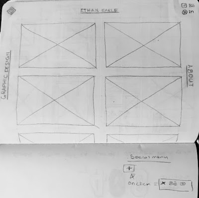
At the moment it doesn't look spot on the same as the drawings just yet, however this will be tidied up in due course using Webflow.


No comments :
Post a Comment